
 Targeted
Matthew Ware’s Speedway
NAP Contemporary, Mildura, 2023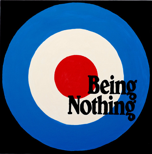
Possibly the first time the Royal Air Force’s post-war roundel — a red centre encircled by bands of white then blue — was appropriated for stylistic purposes was in the film logo for the Archers production company in England, around 1944. It visually punned on an archer’s angled target board, into which a shot arrow pierces the bullseye with a corresponding sound effect. In the first iteration of this logo, a short motif is played by a trio of French horns, referencing triumphant British hunting horn refrains by way of Baroque fanfares.
Let’s do the audiovisual math.
After WWII, the RAF were UK heroes, as the war fought was essentially an aerial one. Goebbels and Hitler had dreamt of bombing St. Paul’s Cathedral with the sole purpose of demoralising the British people. The Nazi’s initiated their airborne Blitzkrieg — the British shortened it to Blitz — but the RAF eventually became the key military force in winning the Battle of Britain. After the war, the RAF roundel was freighted with nationalistic elation, functioning as a proud stamp that proved British superiority.
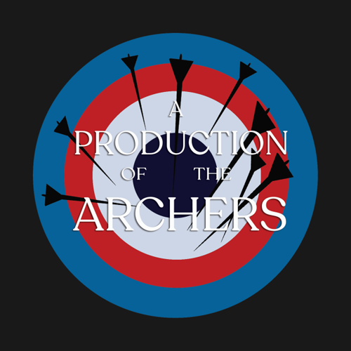
The Archers was the film company of directors/producers Michael Powell and Emeric Pressburger, who together advanced a heightened stylistic sensibility in British cinema. They celebrated the form’s plasticity, its inherent theatrical pose, and the florid way in which text, performance and visualisation could be spectacularised on the big screen. Their immediate post-war colour films — A Matter of Life And Death (1946), Black Narcissus (1947), and The Red Shoes (1948) — were Technicolour bombs of spirited entertainment, dropped into the grey and drab visual psyche of the British still dealing with rations amidst urban rubble and destitution.
A similar moment of cultural impact would occur a few years later in the world of Art. Eduardo Paolozzi (a Scottish artist born of Italian parents) was interned in Britain during WWII, after which he moved to Paris and connected with key Modernist artists between 1947 and 1949. Parallel to his sculptural practice was his collection of American media ephemera, largely disposed of by stationed GI soldiers. Returning to London, he set up his studio in Chelsea, where his hoarded collection of magazines, wrappers, toys, pulps, badges and paraphernalia were interred. In 1952, he gave a slide lecture presenting this material. He called the talk "Bunk". He said very little, instead bombarding the small gathering with a barrage of brightly coloured illustrations, photos, film stills, pulp covers and logotypes.
The gathering upon whom Paolozzi dropped his ‘image bombs’ was the first official meeting of the Independent Group: a small but seminal team of British artists and writers seeking to embrace American popular culture as a topic for serious aesthetic inquiry. A short-lived critical coterie, they would collectively stage two important pre-Pop exhibitions: “Parallel of Life and Art” at London’s ICA in 1953, and “This Is Tomorrow” at the Whitechapel Art Gallery in 1956.
A few brightly coloured, opera-fawning movies from the late ‘40s, and some brightly collaged, USA-worshipping designs from the early ‘50s. These two small cluster bombs of image-conscious artifice did little to transform post-war Britain, either aesthetically or critically. It would take another generation to do that.
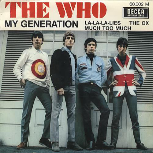
The Who’s "My Generation" (1965) — its single and LP of the same name — was accompanied by publicity photos of the group dressed in a selection of Mod gear that merged Op Art with British national logos, like the Union Jack and, yes, the RAF roundel. Surveying the photos of The Who from the LP’s shoot, one spies how the members literally exchanged outfits with each other for various shots, including a Union Jack coat and an RAF T-shirt. These were signs not simply of Swinging London, but of how the post-war battle between Pop-ist rowdiness and traditionalist decorum was complexly distributed across the battle fields of fine art, graphic design, fashion, and popular music.
The Who — and their devoted Mod brigades — looked like they were covered with the detritus of this Battle of Image. Amidst it all, the RAF roundel became the definitive icon. It would come to resemble the Union Jack blurred into a speed ball, easy to swallow and captivating the eye and ear alike. Mods took up ingesting ‘blue’ amphetamines — just like their ‘old generation’ father soldiers who were high on the drug, dive-bombing their Spitfires during WWII.
A year before "My Generation" was released, Jane Deverson and Charles Hamblett published Generation X (1964). It collects interviews with Mods, collating their angry argot into a series of rally calls against a still-conservative post-war British society. The Who’s “My Generation” is essentially a soundtrack to that book (the lyrics give it away: “Talkin’ ‘bout my g-g-generation”).
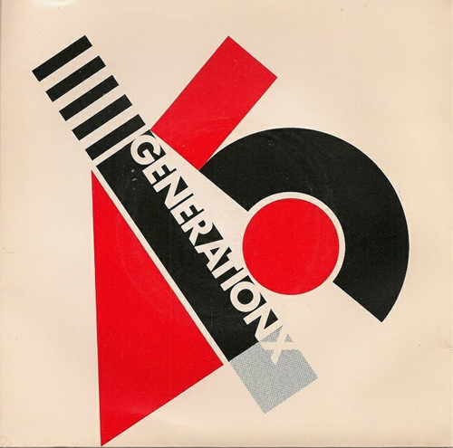
A decade later, Punk would take The Who to task, ironically while usurping the over-amplified noise of British Beat music. Generation X’s first single “Your Generation” (1977) simultaneously is in love with Mod style but desperate to carve its own tribal mark in music. The cover design by Barney Bubbles suitably collides Russian Constructivist graphics with an Op-inspired deconstruction of the numerals “4” and “5” (as in the revolution speed of a 7” single). Guitarist and stylist Tony James swung his axe just like Pete Townsend. James also supervised the group’s early Op T-shirts — one featuring an RAF roundel — which they wore in publicity photos, just like The Who did before.
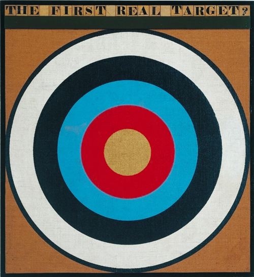
Across this Mod and retro/neo-Mod period, British Pop Art tentatively sprouted. Yet the likes of Richard Hamilton (of the Independent Group), Peter Blake and David Hockney extolled a somewhat grubby, washy handling of media imagery, more like artsy, brushy figurative painting than bright and hard-edged Pop-oriented appropriations. Plus, they were probably too cerebrally quotative for their own good. For example, Blake’s The First Real Target (1961) is a smarmy take-down of the target roundel applications in famous neo-Pop and para-Op paintings by Kenneth Noland and Jasper Johns.
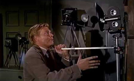
Over in movieland, the Archers film company had dissolved, leaving Powell to go it alone with his own company which still used the target opening film logo. The last film it was used for was Peeping Tom (1960). It centres on tortured, amateur filmmaker Mark Lewis (Carl Boehm) who (ahem) stalks unsuspecting women, ensnares them as if about to rape them but instead whips out his film camera and tripod, one of its legs sharpened into a deadly spike. Underneath the camera lens is a small mirror, so that the women can see themselves die as he stabs them while filming them. He develops the films for his private entertainment back in his dismal flat.
The film opens with an arrow piercing a target’s bullseye; it finishes with Mark stabbing himself while gazing into his bullseye mirror. The film’s uncompromising and hysterical swill of sexualized violence also killed Powell’s career. It proved to be the type of acidic Pop Art that Britain wouldn’t come near to producing for at least another three decades with the “Sensation” exhibition at the Royal Academy of Arts in London (but that’s another story).
Dropping bombs, shooting arrows, smashing guitars, stabbing eyes, making noise, attacking generations. This essay has something to do with Matthew Ware’s series of ‘target’ paintings. I’ll leave it for you to work out what that might be.
Text © Philip Brophy. Images © respective copyright holders.
hyper material for our very brain
All contents © Philip Brophy with great pain of taking.
Please accept offensive behaviour.
We have safety but for children.