 Ice Floes Response
Ash Keating
published in Memo, Melbourne, September 16th 2023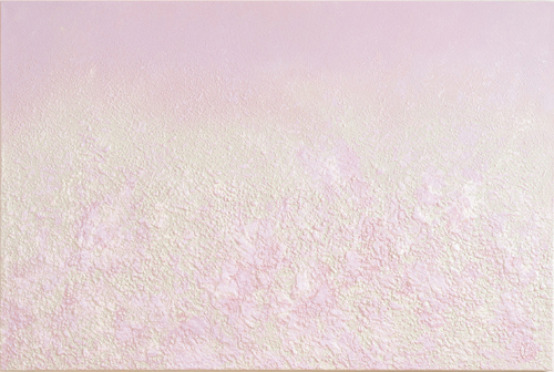
The public mythology of Ash Keating has been moulded around the hybrid figure of a “fine art” painter incorporating the techniques and procedures of “street art” (tags, throws, bombs, pieces, etc.). The result is abstract works that straddle the infinitely shrinking line between art, design, and decoration. This review of his current Melbourne exhibition seeks to highlight his superior approach to what we might term “expanded field pastoralism,” while placing it amidst the complex cultural transcoding between Street Art subculture and High Art superculture.
So, before we tackle strategies of painting, let’s deal with the Black elephant in the room: graffiti. Just as Picasso’s Cubist portraiture was co-opted out of “dark continent” spooky masks, the distinctly African-American-Latinx visuality of graffiti underwent a transmutation from “anthropological” signage into High Art artistic statement: 1970s subway tagging in Brooklyn and the Bronx had become paint signing in Chelsea and Tribeca by the 1990s. Graffiti transitioned to Street Art through its twenty-first century subsumption into a global lifestyle milieu that rewards gratuitous creativity and street cred posturing. Countless urban city councils utilise Street Art to emblematise the banal aesthetics of upward mobility dressage that signposts gentrification zones. And always throbbing at the optical core of any commissioned mural in these situations is a palimpsestic echo of Wildstyle lettering and Electro avatars. Through the multi-layered co-option of Black icons and tokens — anthro, pomo and retro — Blackface has thus become as ubiquitous as to dilute its original problematizing nature.
The murals of Street Art function as urban wallpaper to produce a network of exterior wrappers for soft power expansionism. Against these facades of ocular edginess, people perform like mute minstrels on facadist stages, living the fantasy of being born into a culture to which they have zero contact. So many people of widely differing stripes either knowingly or innocently dress in an ironic swirl of basketball bling and Hip Hop hallmarks. No matter how Viceland or Resident Advisor tries to hawk it, this terrain is nothing but the expanding superwhite suburbia of Melbourne’s vacuous “inner city.”
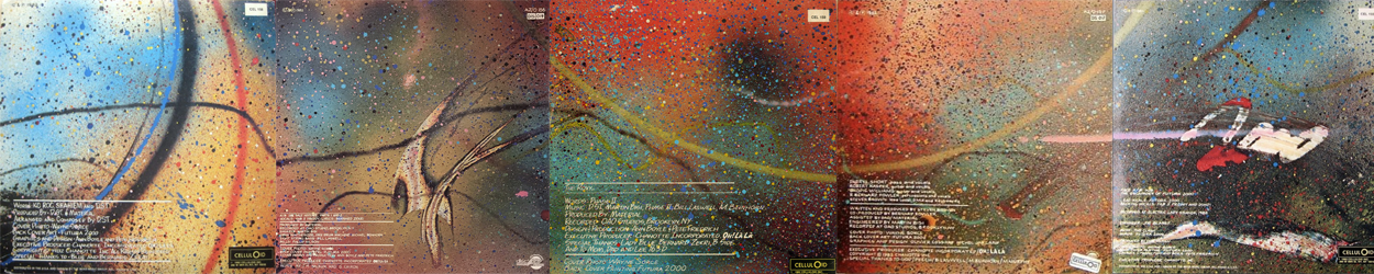
Flash back to the early 1980s. A seminal figure from Graffiti’s cultural cross-over moment is the artist Futura 2000 (Leonard Hilton McGurr). He toured Europe with The Clash in 1981, creating a large mural behind the band as they played their set, and was one of the first graffiti artists represented by Fun Gallery in New York. In 1982, he produced an extended horizontal canvas which was printed across the backs of five 12” singles for the Celluloid Label in 1982. Like his gallery murals at the time, the covers form a wide-screen jigsaw of cosmological spots, drips, flicks, and flecks, generating a visually engrossing world of organic micro-detailing. At this early point, Futura 2000 was distinguishing himself from the normative iconography of Street Art, tending instead towards a distinctive vocabulary of gestural streaks and signatory squiggles. In the mid to late 1990s, he was recouped by Mo Wax Records for an exhilarating run of covers for DJ Krush, UNKLE, and others. Futura 2000 remains an important if side-lined figure due to his dedicated exploration of painterly phenomena, and how its materiality abstracts a visuality that is at once liberating and transporting. Instead of performing street cred nativism by replicating the style of subway car artworks, Futura 2000 synched to and extended the cerebral modalities of American Abstract Expressionism and French Tachism—which they developed through their interpretations of gestural and textural mark-making in traditional Japanese screen painting.
Two important streams position Graffiti as art: its industrial adoption and its production mechanics. The first widespread application of aerosol spray dispensers came during World War II in the form of “bug bomb” insecticide spray. Shortly after, hand-held spray paint tins became a widely used domestic form of industrial painting, downscaling the larger handguns used for coating vehicles in factory lines. By the 1970s, pressurised airbrush technology was at the forefront of commercial illustration, producing slick and deliberately sterile photorealistic images for glossy magazines (Hajime Sorayama, Philip Castle, et al.). Prior to this, airbrushing had been used since the 1950s for retouching or doctoring photos, from Hollywood publicity shots to official Stalinist records. In the 1970s, the deployment of a spray can to produce “art” was tainted by these decidedly unartistic connotations.
Just as contemporaneous theorists and critics tended to ignore Graffiti’s artistic value due to its industrial adoption, so too did they ignore its production mechanics. Equal to Abstract Expressionism’s embodiment of gesture and performance, Graffiti was all about bodily dynamics and bodily scale. The Graffiti artist produced work by balancing on toes, stretching limbs and extending arms, to execute sweeping arcs of paint on a commandeered surface. The resultant work—less its representational elements and more its abstract decoration—documented the body’s instrumentality in mark-making, thereby aligning it with the bodily statements made through the performance artefacts of Carolee Schneemann, Yves Klein, and Hermann Nitsch. Most importantly, as Graffiti transitioned to Street Art, its millennial techniques upscaled these dynamics by augmenting human/machine mechanics to produce large scale throws using water-guns, pressure hoses and fire extinguishers. As an artform, Graffiti blends its industrial adoption and its production mechanics, combining the spread of the former with the detail of the latter. Ab-Graf sprouts from this original bifurcation and applies strategies of upscaling to a plein air simulation of the expanded field canvas—the realm within which Ash Keating’s “expanded field pastoralism” is formally and aesthetically situated.
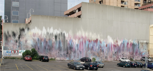
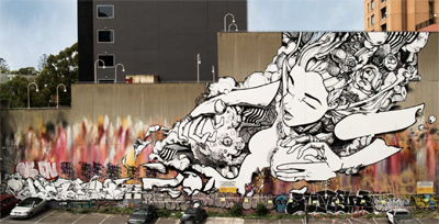
Keating’s first memorable work was executed across the length of a bare concrete wall in Mackenzie Street in Melbourne’s CBD, back in 2004/2005. A massive blank wall bordered an open car park on the corner of Bell Place, reaching back for half a block. Its length and spread were perfectly attuned to the perspectival position of travelling along Victoria Street, making it an acute example of maximising the experience of Street Art, which is often viewed in motion. At that point in time, Street Art was still painfully orthodox and retro (I’d say “anthro”), so Keating’s abstract panorama was a riveting public yet anonymous statement. It was simultaneously self-instating through its conceptualisation, and self-defacing through its “drippage.” Vertical smudges of burgundy, orange, cream, white, baby pink and gun metal blue draped the wide wall like a melted, ectoplasmic curtain, the palette screaming from the dull grey backing. The contrast was particularly heightened by the diffused light of bright yet clouded days in Melbourne’s autumn.
At the time, I did not know who produced the wall, but it reminded me of two works in particular: the eight curvilinear panels of Claude Monet’s Water Lilies (1918) as installed in the ovoid chamber of Musée L’Orangerie in Paris; and the nine panels of Cy Twombly’s Nine Discourses on Commodus (1963) as installed at the Guggenheim in Bilbao. Both works create their own panoramic linkage between “unpainterly” acts of smeared action, where each panel presents blurred “unrepresentations” that phenomenalise the evidential paint. (Twombly’s work shares a near-identical palette to Keating’s mural.) But the Mackenzie Street wall was neither appropriative nor quotative. Like Futura 2000’s spray can panels, it dissolved the socio-cultural barriers that had been fortified to heroically champion the aesthetics of the Street artiste: Keating and Futura 2000 submerged themselves in their abstractionist cosmology.
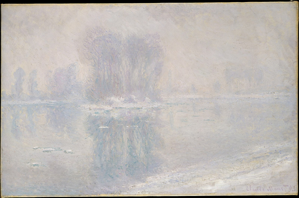
Monet is cited in Keating’s new work, Ice Floes Response (2023). It’s a suite comprised of around a dozen works, all crafted in response to Monet’s own series of a similar number of oils, collectively referred to as Ice Floes (1893). (The suite is exhibited at At The Above in Melbourne, while a large triptych is on display at Museum Langmatt in Switzerland.) Monet’s suite was a response to the period of unseasonable snow that occurred in the Christmas of 1892, leading him to capture the Seine’s overcoming of white fields, particularly near Monet’s studio in Giverny. The works vary slightly, but the most memorable are dense canvasses of pale tonality, leeched of nearly all colour. Their optical sensation could be regarded as a form of “meta-Impressionism.” Instead of performing the genre’s standard dissolve of colour schema—registering the dizzy phenomenological impact of OD-ing on flora— in this series Monet was essentially painting light itself. The icy white is captured as a blinding de-optical mechanism, smothering and blocking Nature’s decor with what amounts to an overload of reflector boards. At a pre-photographic moment in Modernism, Monet renders neither an indoor sky lit studio or a bountiful plein air vista, but an organic in-situ assemblage of natural occurring reflector boards. He captured the Seine’s momentary transformation into this type of apparatus, one that in the early twentieth century had not been rationalised into an auguring of climate crisis.
In theoretical measure, this is what Keating’s methodology both repeats and extends into a contemporary moment. A landmark mural of his is Westpark Proposition (2012) at Truganina on the Werribee Plain, painted across twelve towering concrete slabs which function as the side wall of a two-storey high fifty metre long warehouse. The resultant pastoral vista fired upon the walls is like an optical echo of the surrounding basaltic flat land. Three horizontal bands stretch the length of the concrete walls: a rush of yellow dots of Button Wrinkle Worts; occasional eruptions of tanned thistles atop a new Spring verdant spray; and distant volcanic smudges abutting a bright sky evaporating into sheets of pale blue and white. Contemporaneous descriptions make more of Keating’s Street Art appropriation instead of considering the Impressionist legacy he acknowledges while utilising an alternative technology of on-site reproduction. The new Ice Floes Response is clearly aligned with Keating’s mural practice as much as Monet’s visual rendering.
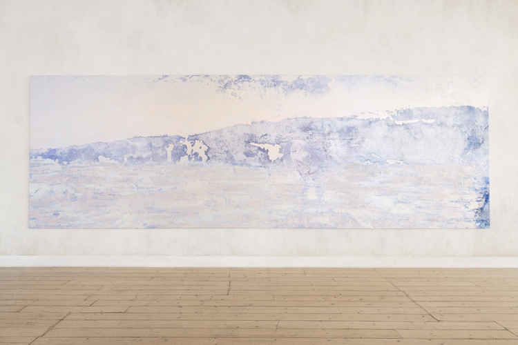
One large stretched canvas—simply titled Ice Floes Response (2023)—utilises pigments, synthetic polymers, moulding paste and glass beads. It overtly references topology and planar perspective, with a sense of grounding balanced with an apparition of a horizon. It’s highly abstract and overloaded with texture, resulting from a myriad of applications that recall some of Max Ernst’s post-war de-landscaping through frottage, grattage and decalcomania. The horizontal mural almost functions as a signpost of interior perspective: the work is small for outdoors, but certainly big for indoors. The rest of the paintings follow this dictate and operate as wall-desiring objects that invite close inspection and distant sensation. But more so, the remaining paintings in the suite propose a new and potentially radical iteration of “landscape painting.”
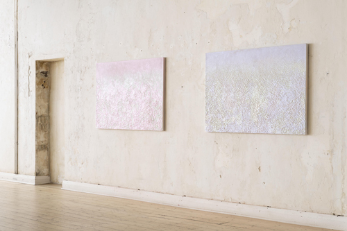
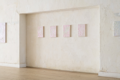
On the surface, these works are highly similar, strategically enforced by their titles as if they are industrial permutations of colour hue from a paint factory: one batch numerically increases from .IFR 02 (Violet) while the other batch does so from .IFR 01 (Blue). They are each produced materially from pigments, synthetic polymers, moulding paste and glass beads (as with Ice Floes Response) but to which is added perlite, vermiculite, and mica flakes. The result is a kind of aerial perspective rather than a depth-dangling suggestion of foreground and background. All the canvasses are near-white, but toned with ghostings of blue, pink, mauve or turquoise. The embedded textures are less those of Abstractionist techniques—or even Street Art gestural splat—and more a type of industrial processing, as if each canvas is a sample of wall rendering. Let’s call it meta-Street Art: no longer marks upon a surface, but the mark of resurfacing. Some patches resemble glittering sandpaper; other patches, steamrolled blobbiness. The overall effect is less painting and more relief. The panels seem like fragments of something that has already been covered over, almost like successive archaeological layers of Council-patrolled “clean-up” operations—possibly undertaken by petty criminals and street taggers doing community work for Corrections Victoria. In this sense, Keating—like Futura 2000—is dissolving his own Graf background into a progressive practice that eschews anthropological back-story sharing for focussed material exploration.
Like any engaging Abstractionist, Keating’s Ice Floes Response suite offers plenty of distinct tonalities with each work, making the gallery viewing a fulsome experience. After a while, one’s sight becomes recalibrated to the level of detail in these predominantly white paintings, which in turn widens one’s sensory pleasure of their pearlescent aura. And it was at such a moment that I imagined a sly activist angle to the series’ framing of a century-old instance of snow, ice, and climate unpredictability. Flash forwards a hundred or so years from now. The current and previous generations of angel/fairy/princess children—those who saw Frozen (2013) and Frozen II (2019)—have long discarded their bounty of Chinese-produced wings, dresses, crowns, wands, dolls, and toys into landfill in every nation image-bombed by the Walt Disney industrial complex. Nothing came of their dreams for a better world. Their corporatised, talismanic toys ended up adding to planetary detritus like PET bottles in oceans. But the point is that while Keating has to an extent aligned himself professionally with modish zero-waste and recycling declarations (it would be impossible for a successful artist to currently survive without acknowledging these sort of pressures in the commissioning of “public art”) his murals and, now, his paintings are complex and sophisticated propositions in paint: their message arise from their materiality. Outlasting Climarte mythology and its suffocating presentism, Ice Floes Response proves that the field’s nexus of art and activism can produce a conceptual voicing that arises from abstraction’s wider application and interpretation.
We finish by flashing back to 2015. We’re at one of the accursed “White Nights” in Melbourne—a Council-supported mega-event (copied from Paris’s Nuit Blanche) that only journalists, economists, sociologists, and anthropologists would point to as evidence of “art and culture.” One event was “Graffiti Mapped” by the newly formed Juddy Roller (a Street Art network who “want to revolutionise the way society engages with public spaces”). Touted as “an exploration into barrier breaking, interactive street art,” it involved Brisbane-based Graffiti artist Sofles doing a large-scale mural onto which motion design by Grant Osborne was projection-mapped to a soundtrack mix by Opiuo. The wall they used to stage this event: the expanse already covered with Keating’s 2004/2005 extinguisher panorama in Mackenzie Street. By that stage, the lower band of his mural was covered with cruddy, high-school, jelly-letter blob tags. A video on Sofles’s website shows a time-lapse of him on a crane, including a section where giant slabs of white are rollered across Keating’s improvised splatters. I wonder if Keating was saddened or bemused by this archaeological inevitability of others “going over” his work. His 2012 commission for Christchurch Art Gallery—titled Concrete Propositions, a similar series of bleeding vertical expulsions, this time in fiery hues—was eventually tagged, leading him to recreate the work in 2016. The recreation employs a palette recalling the Mackenzie Street work, and advances the notion of his practice being one not merely of creating and producing, but of archiving, updating and revisioning.
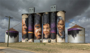
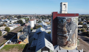
The Juddy Roller network would go on to image-bomb tourist routes in rural Australia. I pity the children dragged along on those Sunday drives through the dead zones of the Wimmera Southern Mallee, now transformed into the mediocrity of the “Silo Art Trail.” The voided wheat mills and storage silos have been “enlivened” by cloying, gargantuan portraits. Two in particular project Indigenous locals as totemic avatars, wrapping their mugs around towering facades that historically weaponised payloads of white agriculture by enabling white squattocracy to occupy blak land in the name of farming economies. The Juddy Roller commissions are mostly heroic portraits of white ‘real people’, but the Sheep Hills and Horsham silos Blackface-blast their visages in an up-scaled gesture not of blak reparation but of that expanding superwhite suburbia. To my eye, the images unnervingly recall the “cute aborigines” painted onto tourist plates by European immigrant artisans making a craft dollar (when the one dollar bill featured not dissimilarly appropriated graphics).
Something tells me that Visit Victoria—and probably the bulk of Victorians—would cry if someone tagged or defaced these officiated works on the “Silo Art Trail.” They probably also cried when they took their daughters to see Frozen too. A hundred years from now, their dried tears will mix with the dust of the crumbling towers that once dotted the “Silo Art Trail.” This is the fuller picture of what “landscape” has become: a ceaseless, territorial battle between ownership, development, tourism, and lifestyle promotion. Its label as Nature peeled off long ago; its fluxive facade is merely textural fodder for drone cinematography. These are the parameters that determine currencies in landscape painting, to which Ice Floes Response truly responds.
Text © Philip Brophy. Images © Ash Keating, Futura 2000 & Juddy Roller/Silo Art Trail.
hyper material for our very brain
All contents © Philip Brophy with great pain of taking.
Please accept offensive behaviour.
We have safety but for children.