 Ego Logos & Euclidean Cum Shots
Emile Zile's Five Production Company Logos In 3-D
Catalogue essay, Diane Tanzer Gallery, Melbourne, 2011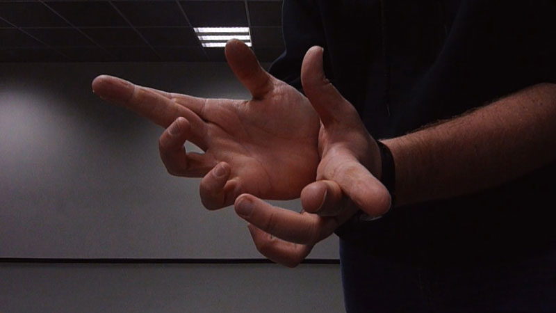
There will always be a hermetic beauty, an insular logic to how typefaces and logotypes exist in a void. Their lettering exists alone, without space, ground, or depth. Requiring nothing but white paper as their field, yet equally capable of being positioned into a page of text or upon a photograph, logotypes are single words whose meaning is conveyed not by their semantics but by their shape. As abstract linguistic nodes visualised as concrete visible forms, they hover in both nothing and anything, charming one with their distinctive configuration and their identity.
As such, this hermetic logic of the logotype constitutes their actuality as a brand. Coke-A-Cola’s fine-print trademark qualification insists that even the ‘dynamic ribbon’ of its logotype (an extension of the tips of the two Cs) is part of the trademarked substantia of the Coke logo. Trademarks, of course, are the legalised entities of the visual identities of which ever corporation is represented by a logotype. The copyright of the ‘dynamic ribbon’ proves the material effect and objectival status of the trademarked logotype. It might be an abstract graphical symbol, but it behaves and is treated like a floating tattoo of disembodied ink, seeking skin to roost.
It is this floating fluidity of the logotype – its propensity to label, emblazon and signify anything it touches or sidles up to – that had governed its morphological development. Heraldic coats of arms from England, embossed wax seals from France, calligraphic signature stamps from China, scorched cattle brands from America (all of which shared origins in classical Greek and Egyptian cultures) prove the logotype to be a graphical transient of identity. The logotype thus is simultaneously rootless and nomadic, while clearly stating its origin and ownership at every instance of its appearance.
The graphical status of the logotype over the last two centuries witnessed an explosion of ways in which legibility can be stretched to extremes – while retaining the ‘object-in nothing’ nature of its corpus. By mid-20thC, logotypes became progressively hyper-abstracted, conjured into near unimaginable ways of utilising alphabetical lettering to express a word.
It is around this time that movie studios incorporated motion into their original graphical logotypes introduced as static credit cards during Hollywood’s silent cinema. The Paramount circling stars, the MGM roaring lion, the Universal circling globe, the 20th Century Fox searchlights – all were monolithic statements of wealth and might. Well, that’s how they viewed themselves. Instead, they were simply … big. As if they each were a newly wrought eighth wonder of the world, on par with Egyptian or Grecian edifices which have weathered the times.
This nascent period of motion graphics – of mobilizing things so that the ‘dynamic ribbon’ effect becomes actual rather than graphical – marks the embarrassingly unconscious statement of ego and grandeur which has always been part of Hollywood (and remains so today more than ever). The whole wannabe-Zeus shtick has defined classicism for at least four centuries, so Hollywood is no different from western-world banks, courts, universities and libraries which for a few centuries at least have made out like they’ve been postmodern-dumped downtown straight from Mount Olympus. The unending insecurity of Hollywood being perceived as lowly entertainment and not lofty art ensures that their self-image will always be one of trailer trash dressed up for the prom (which is what the Oscars’ red carpet most resembles). The major studios’ cinematised/animated logotypes connote weight, mass and power. Like a transmogrified industrial plant ready to thrust a barrage of entertainment into your eyeballs.
Thanks to computers, things simply got worse. When executive producers and studio chiefs discovered how CGI simulation of Cartesian X/Y/Z-axis tracking could make their logotypes appear to actually move in a three-dimensional space, things got bigger than big. Like, so big they were coming at you and over you. The clouds of the Columbia backdrop gather like Zeus is about to let rip with a thunder bolt, the Paramount stars zip out like a line of ninja star knives doing a Busby Berkeley routine, and the Universal lettering sashays across the globe looking like a bunch of drag-queen-letters with solid gold backing. Tacky doesn’t even begin to describe such feats of self-aggrandizement.
One can take vicious pleasure from ridiculing the moronic success of CGI that allows abstract graphics and logotypes – originally born in visual voids and governed by their own formal logic – to ‘break free’ into the ‘real world’ of time-space-as-we-know it. Surely this is as dumb as you can get. Didn’t everyone from Picasso and Pollock to the Coyote and the Roadrunner break the Euclidean barrier of spatial physics to open modes of visualisation not tied to the world as we mapped it to be? Spending lots of money on state-of-the-art motion software to generate this ‘realistic/immersive’ effect at a high resolution is just dumber and dumberer.
Those who employ CGI as if they are magicians collapsing the real into the virtual and back again seem obsessed with gesticulating this process repetitively. CGI motion logos – now the province of much smaller studios thanks the liberating power of computers for all mankind – move backwards, forwards, up, down, spin on fire, dive into liquid, explode into solar systems, and so on, in a way that would make babies say ‘awesome’ if they could talk. More so, the movements and trajectories of these rumbling hurtling rotating logotypes resemble the hand movements of amateur illusionists whose frenetic handwork over-compensates for a total absence of magic. And of course, what word is more overused in Hollywood rhetoric than ‘magic’.
Emil Zile’s Five Production Company Logos In 3D presents an imaginary ‘real man’ behind these grandiose charades born of self-important declaration. Just as design company CEOs probably come in their pants when they look at their Maya-rendered fonts casting shadows on planets, so are Emile’s hands ‘working magic’ as he performs aerial jack-offs synchronised to Adam Milburn’s gilded melodic refrains. His hysterical hand movements hilariously replicate the excessive overload of those corporate logos which move around like Jane Fonda doing Zumba on crack. Best of all, it simply looks like Emile is masturbating as if he uses some amazing technique to whack a super load into our faces. Which is exactly what the proud designers of those gleaming chromed star-cruiser logo-ships imagine they’re doing. And a grand tradition it is, for what is Coke’s ‘dynamic ribbon’ but the allusion to a frothy foaming cum shot.
Philip Brophy – registered trademark
Text © Philip Brophy. Images © Emile Zile.
hyper material for our very brain
All contents © Philip Brophy with great pain of taking.
Please accept offensive behaviour.
We have safety but for children.