 CUT
CUT
Temperance Hall, Melbourne
published in Memo, Melbourne, December 24th 2022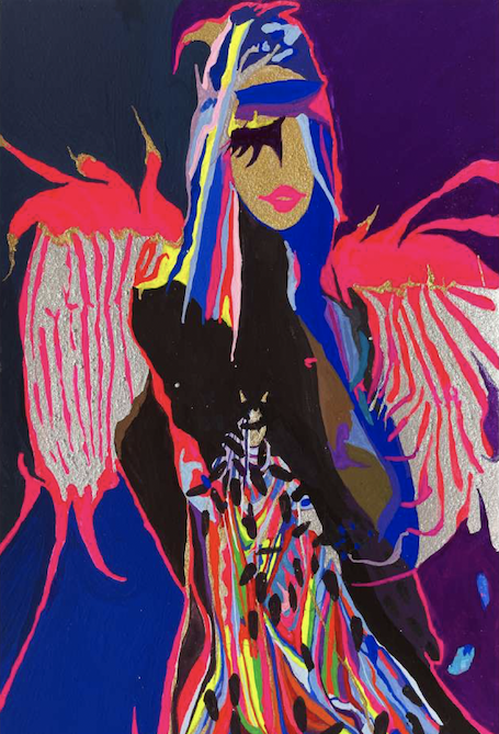
A balmy summer day, upstairs in an old Victorian meeting hall. High vaulted ceiling, creaky redwood floorboards, tall arched windows, walls covered in decades of peeling paint and torn wallpaper. This is what was Temperance Hall in South Melbourne. Politely and tentatively occupying the space: a bounty of small-scale, diminutive works; many on paper, some acrylics or oils on canvas, all exploring collage aesthetics. One had to move close to these works to engage with them: no immersive phantasmagoria or gargantuan grandstanding here.
This is the group exhibition CUT. The selected artists—Rob McHaffie, Alasdair McLuckie, Andrée van Schaik and Constanze Zikos—have been grouped temporarily in this exhibition in an orbit from the stable at Murray White Room. While all artists share a relationship to this gallery, I wouldn’t regard it as being “curated” (which is now what influencers do by posting a sponsor-led listicle). Thankfully, it’s more like a multi-act bill at a gig venue, which means they may or may not relate to each other, and it doesn’t matter either way. Robyn McKenzie’s brief catalogue essay notes their relation to the “cut” aesthetic of collage, but I found the experience of being in the space with the works to be more powerful than their category or identity. Rather, the show’s remit to decipher, decode and discern each work’s puzzling effect made for an absorbing time spent in a transitory gallery space.
Before discussing the works in detail: some reflections on being in that distressed, occupied space, scrutinising small rectangles of magazine cut-ups. After three years of COVID-19 lock-downs, many artists were forced into a not dissimilar situation: squinting into computer screens, scrolling through on-line magazines, attempting to still produce art funnelled through an image-laden but socially-bereft “world” that they sought to reflect, critique or embrace. I can comprehend the existential crisis felt by artists, but I remain highly unimpressed by the op-ed art they produced, which purported to emotionally comment on their situation. For my part, I instantly unsubscribed from each and every arts organisation who group-emailed me about the “essential work” produced by artists, and how “we” should support them. I always thought artists essentially worked alone, choosing to be “non-essential” and forging whatever they desired in ways not articulated by sociologists, anthropologists, educators, politicians or community leaders. In my widely unshared view, the key strength of the arts lies in its amorality, isolationism, insularity, pretentiousness and general distance from mainstream culture. COVID-19’s impact on the arts thus may have sealed the fate of its mandated social responsibility for all and sundry.
Coming at what might be the end of COVID-19’s triennium of terror, CUT offers an unexpected opportunity to consider an alternative gameplay and outcome. I will attempt to justify this claim by considering how the collage-specific works by the four artists in CUT intuitively and thoughtfully address: (i) what it means to make art in isolation; (ii) how an artist looks out at the world from a dislodged position; and (iii) how their manipulation of image as material potentially liberates “collage” from its 20th century origins, gesturing towards a continuum of “imaging” that embeds seeing, looking, being and copying into an expanding visuality that is not tethered to futurologist hype.
Rob McHaffie’s selection is split between a group of paper collages and five oil-on-linen paintings. The collages are mostly singular figures, full-bodied and set against white voids, all but one produced in 2014. Each performs as a figurine assembled from forms, fragments and fabrics culled from fashion magazines of some stripe. The result is inevitably a parade of models, “defigured” in a sense, but hasn’t fashion been about “defiguring” for half a century now? Reclining Man (2014) is an impressive calligraphic spray of indigo denim, Op stripes, a blonde boy bob, and three manicured hands. Touching Face (2014) is an avant-‘60s silver and pearly concoction wearing deep auburn curls heat-tonged over a face comprised of the collars of a Provence pink jacket. All these figures hint at human origins, but delight in an aggressive dressing-up that breaks-up the human form while retaining its operational status as a model.
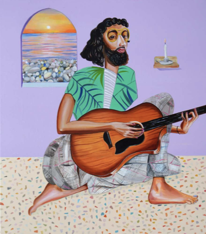
McHaffie’s paintings perform similarly, presenting portraits and figures (one per canvas) whose palette and surface are maintained by a non-perspectival flatness and stilted, even lighting. These are people who not only don’t exist, but were never designed to inhabit a world governed by human optics and physics. Their conglomerative naïveté superficially lies half way between a Sufjan Stevens’ fantasy LP cover and a Portlandia hipster self-portrait, but their vitality and interior presence wins out. Acoustic Noodling (2022) might be one of those dreadful COVID-19 YouTubers crying in their bearded bedroom, but it also is gangly and graceful. Face Like A Waterfall (2021) is coolly affected just like a creative in a Frankie photo-shoot, but its mottled layering and Matisse-like intercutting gifts it an aura beyond the pouting visages of a billion graphic designers.
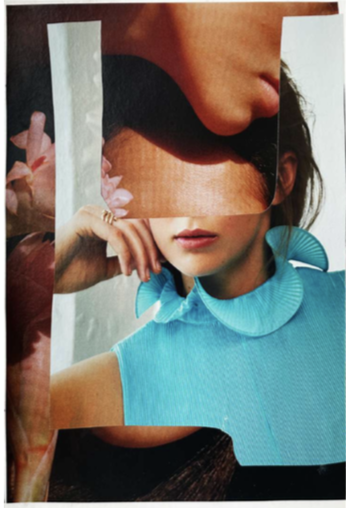
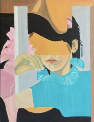
Andrée van Schaik’s eleven oil canvasses (all roughly A3 in size and proportion, produced between 2019 and 2022) are warm and fuzzy simulations of collages, fabricating shapes and patterns as if cut-out images. The brushwork’s softly attenuated sfumato enlivens all the works, just as it blends their discrete elements into a comforting meld. The Mountaineer (2022) hints at dour faces and frilled cuffing, but energises their posing through a map of interlaid planes, as if two or three session shots for a glamour mag have been scrambled by a mistyped Google image search. No, this is not post-internet art (a realm beloved by imperceptive curators), but a relaxed and unfussed contemplation of how bits of image can be incorporated into a recipe. It’s sort of like making a meal out of what you’ve got left in the fridge (but not posting it on Instagram). Functional Paradise (2022) does the same not with models but interior furniture, creating a dimensional incursion of objects into the beloved “built environment” for total unfunctionality—or a mental lock-down space.
Van Schaik’s collages clearly suggest their purpose as being part of her painting methodology. The “original” of The Mountaineer is here, titled Untitled 2 (2022) and clarifying the power and purpose of the final oil painting. Its blending of elements testifies to an ulterior way of processing collage effects beyond the simplistic binary of whole/part which historically privileges anything that is complete, finalised and authoritative, and knee-jerks Modernist destruction cut-ups into being. Van Schaik’s collages avoid this completely, and instead are projections of what she maybe can foresee as a painting. They all betray a certain level of glamour, but the heightened artifice that accompanies all glamour photography (the type that rules the magazines from which these images seem to have originated) is what each collage fixates on. They abstract the sensation of glamour in a decidedly non-judgemental way—a hard position to maintain when every bogan and wogan thinks they’re a Kardashian or a Kanyeian.
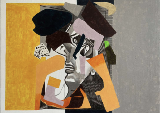
Things veer into a more cryptic state with the works of Alasdair McLuckie. His selection covers acrylic canvasses, woven glass beads on linen, mixed media on mounted boards, and bound concertina books. Two paintings allude to “op shop aesthetics” and collage theories in their appropriation of Picasso’s Melbourne-infamous Weeping Woman (1937). Collage painting/My eyeballs like raisins from staring into the sun and Collage painting/Homo Economicus (both 2021) are, in fact, the one painting, done twice, but what in vernacular slang one would call “same-same”. The titular cry-baby is centred in each, imaged in black and white (to stress its ‘80s newsprint currency) and overlaid by a set of random fragments. The vibe is like a jam between Man Ray, Picasso, René Magritte and Max Ernst. The intriguing difference between the two near-identical paintings lies in a very post-internet device: screen ratio auto-scaling. The comparatively squashed painting looks like an attendant in a Contemporary Art museum has flicked the wrong switch on the video playback (believe me: that is a running gag I wish would go away), but it also is a potential sign of how a whole strata of visual encoding and decoding has shaped the perception of how one views pre-existing media. This is something to which I feel McLuckie’s work is responding.
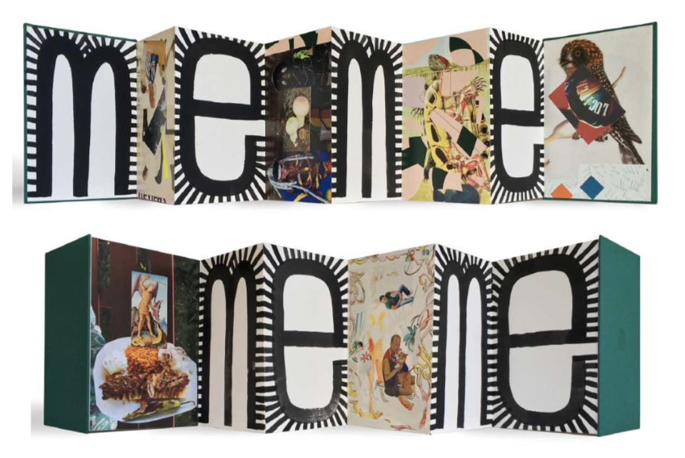
His bound concertina books fascinate. Stretched open into continual fencing, their recto and verso panoramas were accessible by walking around their display tables. Bending down slightly to take them in, I felt like I was studying an architectural model of concrete slab factory parks, where the front and side walls of sheds devoted to micro-manufacturing (i.e., small run, boutique, downmarket, etc.) are now concatenated in countless outer-suburban industrial cul-de-sacs. Isn’t that what artists essentially do now: micro-manufacturing? The more one tries to deny this—by extraneous narration, curatorial conceit, cynical commissioning or plain do-gooder stupidity—the more it proves that an artist is but a node-for-hire in the spotlight of cultural industry pavilion-building. CUT kept everything at the micro level: the artworks’ scale, their chosen methodologies, their artisanal veneer, their temporary off-site housing. And McLuckie’s books (all produced in 2021) I read as a reflection of this situation. Their pages alternate between miniature cut-ups and gaudily inked words or ideograms. The collages are thematically distinct in each of the six books, but more importantly, each sports a loud tag for orienting the nature of their selectivity. Their titles point to this. Untitled (I am) (2021) blares faux-feel-good with a triumphant font and a wacky, glorified “I”; Untitled (trumpets) (2021) flaunts a badly-drawn horn dripping from coiled French Horn tubing; Untitled (Follow) (2021) splits the word into a stylishly conservative “F” and a logistic implosion of “ollow”; and both Untitled (Meme) and Untitled (Meme 2) (each 2021) hysterically blurt the individual letters so they seem to chant “ME ME”. Put them altogether, and the message is clear and sharp: like an Etsy project deliberately craft-bombing a Contemporary Art Space, these concertina books parody the self-promotional SM industry of self-creating (all while cunningly resembling the dark juniper binding of Duchamp’s Boîte-en-valise, 1935-1941). I take it to be how an artist can call-out “creativity” as a current form of bankruptcy and a bankrupt form of currency.
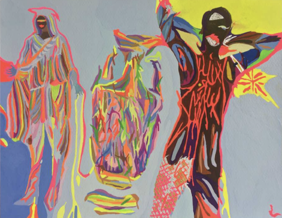
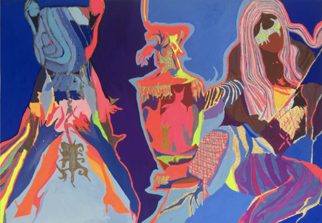
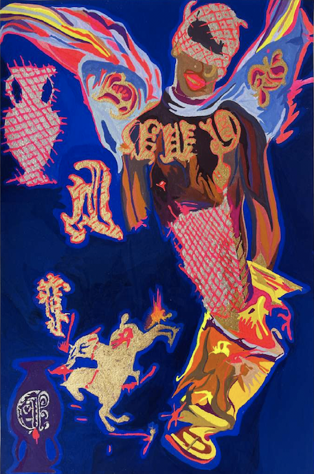
And finally, the lurid colour blasts of Constanze Zikos’ ongoing series Pin-ups (three sets of six, all produced 2022). Robyn’s essay informs that Zikos has been making these small gouaches for three decades; it’s my first time encountering them. Yes, they inherit the perversely wry and clinically precise graphic sensibility of Zikos’s numerous excursions into interior fabrication (in all senses of that term), but they also quiver with an explosive charge that is neither desultory nor inflammatory. In fact, the word “gouache” fails to prepare one for their toxic-shock colour schemes. Like many of the works in CUT, the Pin-ups series mostly features cropped images of posing models, here interred in weirded-out, nightmare night clubs—or maybe share-houses just before heading out for the evening. But here the figures are not cut-up but coloured-in with delirious artificiality and unnaturalism. A visual consistency shines through: flamingo pink flaming against corn-starch blue; hot rhodamine carving into deepest purple; and gold, silver and bronze (sprinkled or simulated) erupting from matt citron. (Think Wham!’s Wake Me Up Before You Go-Go video mashed by 1000 Gecs.) Human figures prance and contort, making love to the photographer’s lens—but the intriguing aspect of these blazing gouaches is that there is neither lens nor model. Zikos has created psychedelic ectoplasms of human figures, embalmed in the printing, stitching, beading and brocading that camouflages any humanness they once may have had. Literally: they are what they wear.
Zikos proves to be the elder statesman of collage in CUT. As such, his works are the most elasticised when it comes to appropriation, allusion and accretion, stretching into a near but distant past, and pushing into a present obsessed with that past. Pin-ups possibly refers to the ur-text of put-on glamour, Bowie’s Pin Ups (1973), with its pan-human duo of Bowie and Twiggy reconfigured on the front cover like parasexual Pierrots, their maquillage by Pierre Laroche. (Recorded at the Glam mecca studio, Château d’Hérouville, Pin Ups is Bowie going full-French.) The LP is possibly the shiniest black hole of Pop music about Pop music ever made—or at least, the template for all successive transhistorical, meta-style mash-ups that proliferate with increasing frequency and diminishing span in audiovisual culture. It’s meant to be Bowie’s teenage faves c.1964-1967 deconstructed as Glam, but they are so radically toned and buffed that their plasticity gleams more brightly than any reverence the project might have once held. The dressage of Zikos’s abstracted figurines to me are like the phenomenon of Hyper Pop rendered image—weirdly so, considering how image-obsessed Hyper Pop is. Zikos’s Pin-ups employ sartorial style that riffs on all the key historical figures in this realm: from Freddie Burretti’s Italo-pimpery, to Vivienne Westwood’s imperial decimations, to Michael Braun’s WWF outrageousness, to Stephen Sprouse’s pseudo-street-style, to Gianni Versace’s palatial hallucinations. And let’s close the loop here: the finery displayed in Zikos’s acidic Gothic brushwork and strangely fluttering shapes particularly reminded me of former Bowie-designer Kansai Yamamoto’s gene-splicing streetwear collection by him and his protégé, Quenta Takaya—staged on the Shibuya crossing past midnight during the COVID-19 shut-down Tokyo Fashion week of 2021, with no audience, zero traffic, and live-streamed as a ghostly catwalk.
OK. Some great work by a cool gang of four, showing in a dumpy but chic inner city space. How does this relate to COVID-19 and artists locked-down at home producing art that, they or their curators claimed, dealt with their “present moment”? While all the CUT artworks displayed and discussed here stand firmly on their own terms with individuation and sophistication, their conjoin in the one room (ironically, pinned to the dilapidated walls of a community space encouraging abstinence) laterally reminded me of the kind of art that artists make alone. Not in their studio (a holy grail for the rent-insecure) but in their cramped inner-city flat, bedsit or bedroom. No serious artist wants to be “starving in a garret”, but the micro-manufacture of art under contemporary gig conditions is essentially that. And the starvation is more cultural than financial: there is hardly a single noted contemporary artist living and working now whose “practice” does not become a “schtick” in the mediascapes across which their work floats like a free-market vector, able to be mimicked by anyone in any tiered department within the “cultural industries”. Worse, their work is rarely diluted, contradicted or denigrated: it is perfectly comprehended, recontextualised and applied—just as any contemporary art commission will now be perfectly reduced by both its ethical didactic panel and the special “kids event” of its accompanying public programme.
I laughed through pretty much every iteration of the millennium mambo of NEW exhibitions at ACCA (2003 to 2014) where artists were ultimately given the chance to publicly declare that they no longer made art in their cruddy inner-city bedsit. NEW saw artists bulk-up for the new obesity of architecturally gaseous buildings for displaying contemporary art. My laughter was nasty but warranted: fine if an artist chooses to play up to their institutional entrée, but the resulting works seemed to benefit the institution and its curators more than the artists—despite the supportive rhetoric spouted by the former. Those poor, pathetic artists in their bedsits: might they now more than ever be in the ideal situation to both critique image culture and its entropic industrialisation, and to most effectively make something on their own terms by choosing not to be purely the proud outcome of some enabling mechanism?
The artists in CUT trade in image-based painting—not simply pictures or acts of picturing, but intuitive strategies and methodologies that ponder and process contemporary imagescapes (all inevitably and undeniably mediated and mediatised). They do so without either resorting to moving image technologies, or residing in moving image culture—two technotopian realms that Contemporary Art is forever fluffing and fellating. Quite the opposite to exhibitions that plead viewers read the displayed art as being relevant, identifiable and current, CUT was an exhibition of dynamic stillness. Its energies are derived not from 20th-century tools of collage, bricolage and montage (though the works appear collectively informed by the seminal Pop collages of Eduardo Paolozzi, Toyen, Linder Sterling, John Stalin, et al), but from 21st-century tools of searching, scanning and signalling. Neither interventionist nor corrective, its small and affordable items were pipe lines from the surplus swamp of images. Under the artists’ configurative tactics, their contemplative collages allowed the viewer to feel powerless, insignificant, ineffective, and “same-same”—just like everyone else during COVID-19. The worse thing about the pandemic? When it’s over, everyone will celebrate being powerful, significant, and effective. Same-same.
Text © Philip Brophy. Images © respective artists.
hyper material for our very brain
All contents © Philip Brophy with great pain of taking.
Please accept offensive behaviour.
We have safety but for children.